I wanted to try print my own typography, similar my lino print, so these lettered stamps were hanging around campus and I thought I’d give it go.
 I simply mixed acrylic paint with water, to make it more “sloppy”, this was to make sure it printed evenly. I feel as though I could take these prints further buy building up in different colours, I could even use brio pen to add a hard edge.
This process worked well, and has created a more sufficient lettering than photoshop fonts, but I don’t think I’ll use them on my design as they don’t give the right aesthetic.
I want to try a lino print again, but maybe make a range of different hand rendered typefaces, that I could potentially use.


I wanted to create an old aesthetic, so I chose to soak paper in tea and coffee. This is a process I have done for years and is usually to create something that is to appear old and torn. The above image shows the samples of this process, but has elements that I would change if I decide to use it. I would change how tea stain has been produced, possibly by opening the bag and using pure tea in the water instead (unsure how this will look) just to get rid of the dark circles, and hopefully appear smoother and have softer edges.
As the paper hasn’t dried yet I haven’t made my final judgement.


I scanned in the specific prints I wanted to use and manipulate. I chose the prints that had the most qualities, areas of interest i.e where there is blank spaces of missing paint/ink to add contrast between the ink and background. I like all the different marks that are made randomly so I wanted to ensure they were on show in the design. I wanted to highlight the edges on the brown paper to act as a boarder to help add details and points of interest. I displayed the designs on brown cardboard and paper to keep the rustic style.


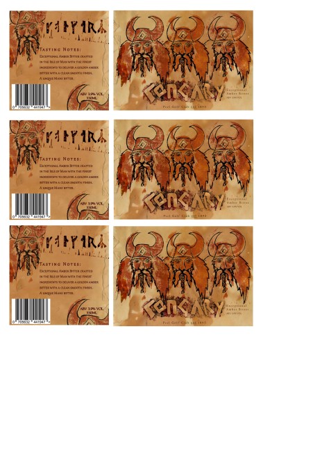
I explored the typeface further and found a better font that matches the design better and fits the composition and theme better, especially the typeface on the back of the beer label, even though it does not resemble a lino print style, it still matches the traditional theme of my hand rendered text. I changed the text to pick up from the colours on the front of the design to keep the trend. I also added a second colour to the text by adding a stroke this just helped to tie in the other colours.
I admire the composition on the back, it still communicate camaraderie and social aspect. I also like how the helmet at the bottom of the format frames the important information, it helps to break up the plain back ground and text.
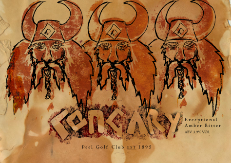
I am happy with how my design has turned out and I feel as though it works well and communicates properly now.
