Basic bottle shape, either transparent or generic brown shade. Bold, clear text and logo stands out from the colour of the bottle. I like the use of imagery in the bottom image, they all have a great design, some relate to the Isle of Man using words and images to communicate this. 
This design suggests to me that it is quite creative and modern, with a middle class taste. The patterns that surround the typography describe to me that each have a unique taste and something that does not taste ordinary like an ordinary drink.

This set of drinks communicates itself differently to the first set, the design is saying something else. I think the designer wanted to communicate a traditional drink, a traditional Mexican beverage. The design shows different ideas for tradition, such as the imagery/illustrations they have used, the drawing suggests their culture, the myths and legends and a Mexican identity. I feel as though these would have very different tastes, maybe sweet or sour.

All have very different styles and aesthetics


![]()
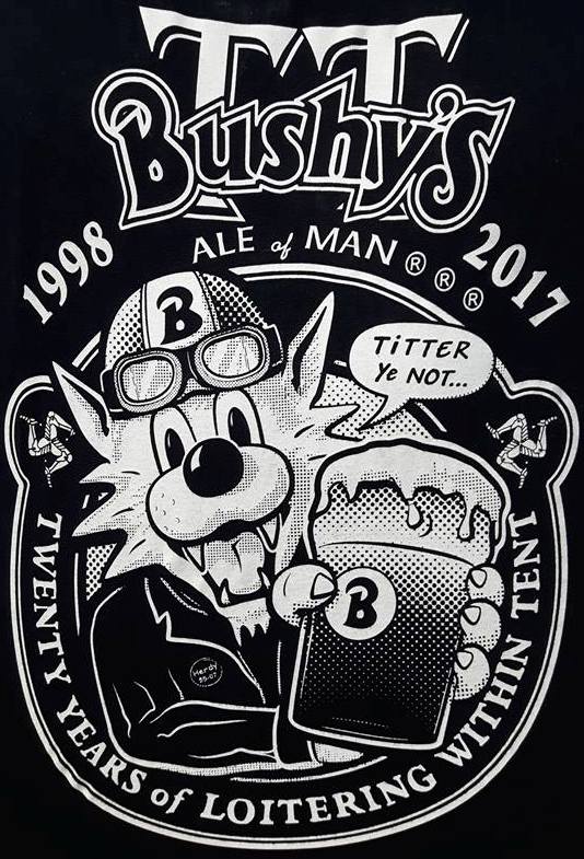
I like the Bushy’s logo and character, I feel as though this has been an iconic design for many people, tourists and residents. I want to try communicate the same using a cartoon character to be the face of the beverage.


Some of the images don’t work for reference, as I am redesigning a bitter, not a larger, the difference between the two is that a pint of larger has a foaming top, and a pint of bitter appears to have a flat top, making them distinctive to each other.


Studying how the highlights, mid tones and shadows work. Light it very hard to draw from first hand thoughts, so it is easier to observe how a glass looks in everyday life. I like how the glass with a handle appears, it reminds me of being in Amsterdam or Finland, but the way the pint of bitter looks it would not be the best to use this shaped glass. The middle image of the tilted pint glass is the best to reference from because it has the same angle that my drawing has and has less lighting points. I feel as though I have successfully drawn the way the glass could look, looking at all the different lighting and angles.


![ClrHobgoblinLabel [Converted]](https://1997kherreegoldie.files.wordpress.com/2019/03/hob500front.jpg?w=138&resize=138%2C126&h=126#038;h=126 "ClrHobgoblinLabel [Converted]")
![]()
http://www .ohbeautifulbeer.com/


Looking at each unique design and how the composition differs, there are certain graphic principles that they follow in order to create a good design.
Find Your Focus
Direct the Eye With Leading Lines
Scale and Hierarchy
Balance Out Your Elements
Use Elements That Complement Each Other
Boost (or Reduce) Your Contrast
Repeat Elements of Your Design
Align Your Elements
Divide Your Design Into Thirds


Thinking of what kind of setting my design could be in, and as it is Viking based I could relate the setting to things that are associated with them, e.g Viking ships/boats, earthy colours/wood colours, rustic furnishings and boat equipment. I like how these pub/bars are set out as they remind me of the sea and how my brothers used to be fishermen, but I think my setting would have to relate to Vikings more, and possibly the Golf Club too.

hobgoblin poster campaign


Traditional beer stickers (google search)


Affordable stickers


All very effective in different ways, the Worthington’s bitter, John Smiths and Tetley’s use similar design elements. The colour palette shows that it is a middle class to low class drink, it has creative typography which does not seem as sophisticated as the Odin brewing company design. Odin have used very modern imagery and typefaces, but when shown as a logo it still has similar techniques and elements that the other three share, simple imagery and creative typography. These designs suggest traditional and old time classic beers and bitters.


