Using the images I took in the studio to compose a possible layout for my zine. I used a desaturated colour to frame the image, this gave the image a frame and helped to separate the text. I’m imagining the eclipses are hyperlinks, each one brings you to a informative page.
I feel like the layout is boring, but works as an informative piece. Ways to improve the layout could be to add page tabs to the sides or use multiple images. I could maybe add texture to the background instead, ensuring it is suited for the image.
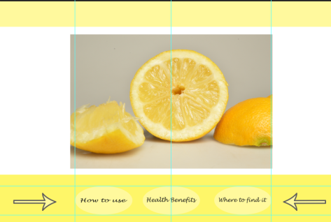
Adding arrows to read like a book, using the narrows to turn the pages.
This is a rough composition. When I come to designing the final piece I will ensure the text is consistent, and not stretched. I feel like the yellow is too strong, it makes the text appear to dark.
Using the same principles as the first layout, but instead it will be shown as one page instead of using Hyperlinks. This way it is read like a digital book, instead of using multiple pages.
I like the way I have framed the info, the contrast between the white back ground or the coloured. I think the honey layout works better than the mint one, the text is easier to read on the yellow, I feel like the blue surrounding the white text box makes it difficult to see at first without taking a closer look. The honey layout seems to have more room to breathe.
I enjoy how the digital paintings look as a zine composition but I feel like the use of photograph is a stronger composition, the pictures look professional and have a cleaner, neater finish. I feel like you miss out on the fine details if it is drawn digitally.
Cropping the image into sections, altering the sizes of each slice to show different shape and details of the image.
For these compositions I decided to go with a more abstract look, rather than a straight linier style. I feel as though these ideas more stronger than my first ones, in the beginning I feel as though it looked more like an application for your phone or device, which does not read as a zine should.
I also included my digital paintings as Gary and Will said it was a waste not to use them, I think it works well using both digital drawn version and a photograph too as it creates a stronger contrast with detail and colour.
The handwritten text works nicer as it appears more organic and personal.
Examples of composition change, composing the text in different areas of the format, adjusting the angles and sizes to show different ways of composing the page. The sage image has been selected roughly to give an example of how I can display the photograph.

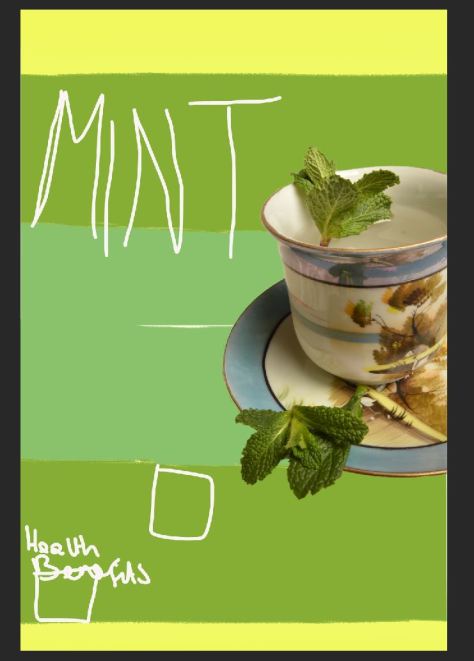
The first image shows a coloured background, looking like a 90’s theme, retro style. The colours highlight the specific colours in the image of the mint and teacup.
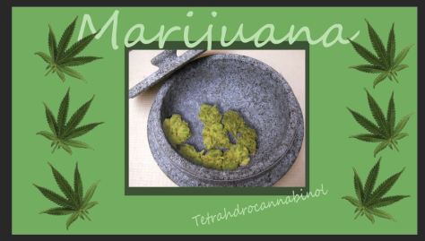
The bottom image is a practise for how the layout for the cannabis page could look using the image I edited and some clipart from google, hopefully for the final outcome it wont looks as linear, I feel as though it needs to be more organic, and less straight edges. The colours work well together, showing a range of tones. The text works well because it looks organic and flowing, but this has a strong contrast between the boxed images.
