https://getflywheel.com/layout/psychology-of-typography/
https://www.script-tutorials.com/infographic-fonts-and-psychology-in-typography/
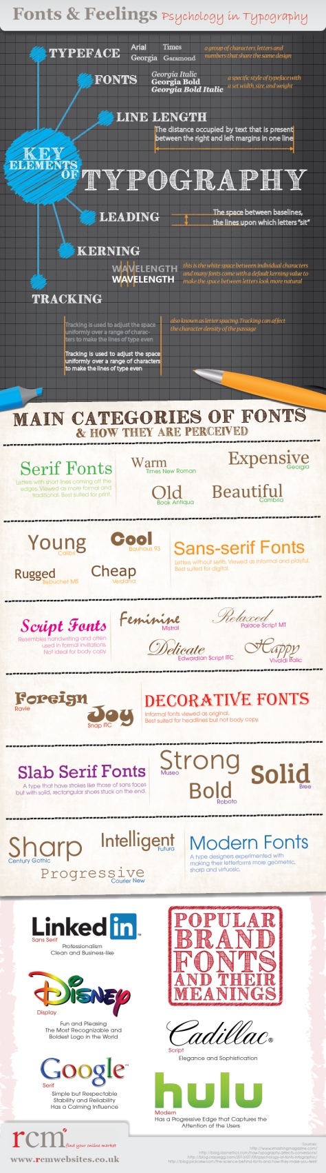
I would suggest using a thin, wiry typeface, with sharp points to represent danger or horror would suit my idea better. I would say the original thoughts on the word ‘free’ would be a serif font, or calligraphy. These two specific font types have a more elegant style, usually have custom kerning and tracking to help adjust in their design.