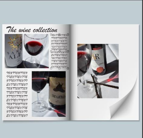
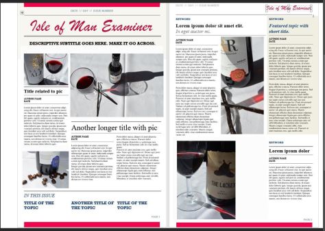
“The wine collection” is a basic layout for a magazine. It looks ok but a bit boring as there is not enough content, and has no guideline, whereas the one underneath shows more context, looks like it is an actual newspaper spread.
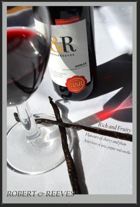
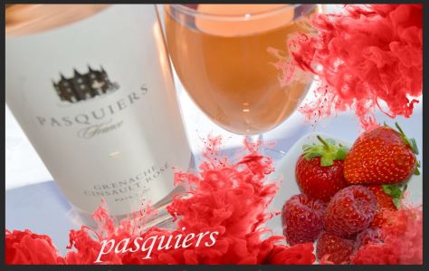
Making a simple wine advert, highlighting its favourite parts and its different elements.