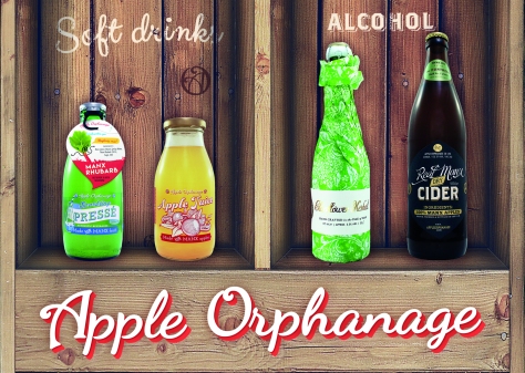
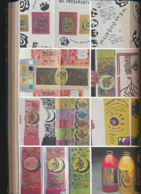
Apple Orphanage have a unique style, using both text and imagery in a very effective way. The Apple Orphanage have become very well known on the island and is a high end and popular fresh fruit drink which is admired by many of us. I enjoy the simple typography and how they have incorporated the imagery. I want to create something that looks as professional but still as creatively as their designs. Minimal colour palette and lots of negative space surrounding the label design.
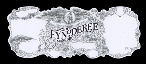
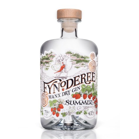
Julia Ashby Smyth (Fynoderee gin)
This a local artist that illustrates the label designs for the Fynoderee Manx gin, she creates complex and detailed designs using traditional methodologies such as pen/pencil on paper, colouring pencils and water colour which are then put through a digital process and printed onto gin glasses and bottles. The design uses celtic patterns and things that are in relation to the source and location. The art has a very noticable and particular style which can be noticed by a wide range of people familiar with the product. This product is something I relate myself to as it is a Manx made product which has a lot of Manx character which I admire.
Complex design
Selective colour
detail and line is prominent
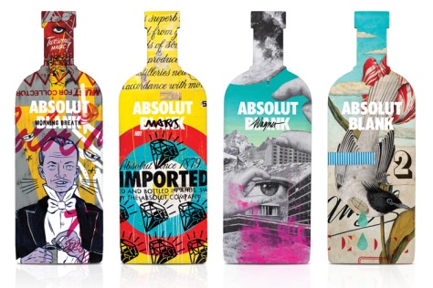
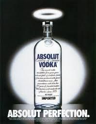
Fredrik Källqvist (absolut vodka) and other absolut vodka designs. The Asolut vodka brand is iconic for their artistic and creative bottle designs. They target modern events and political events while also just experimenting with various art methodologies and how they can combine typography with imagery whether it be a photograph or traditional painting/drawing.
I like their colours, patterns and how extraordinary they are, they stand out against smirnoff vodka bottles because of their crazy aesthetic.

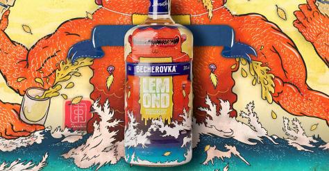
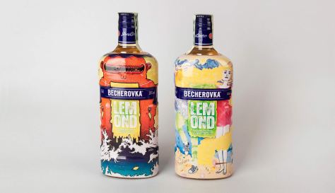
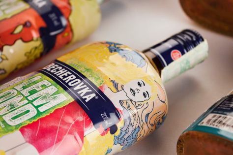
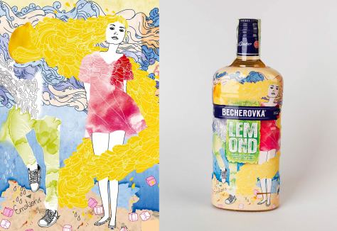
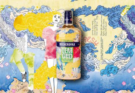
Becherovka Art.Edice (alcohol)
This design relating to the Absolut designs, combing a artistic possibly fine art piece to an ordinary product to create a more prominent and stylised design which viewers would remember more clearly. I want to try create something like this, something that is eye catching and creative using contrasting colours to do so.
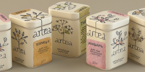
Masha Ponomareva (Tea)
I admire this Tea design, I like how they have created the package, using a simplistic approach to the colours they have chosen and their beautiful hand drawn elements.
I want to try produce something which can be simple without it being boring.
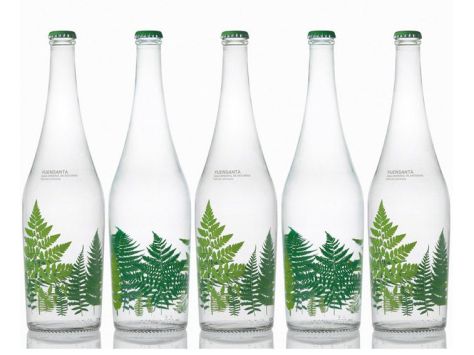
Pati Nunez (water)
I like how simplistic this design is, using realistic images against clear glass to create a window effect, this is really easy and simple but has great potential in making people remember their brand and design.
They have used proportion weirdly in this design, using big and bold imagery and composing the typography a lot smaller, it shows a different contrast as certain designs usually do the opposite or work with both text and image as one thing rather than being two separate identities.
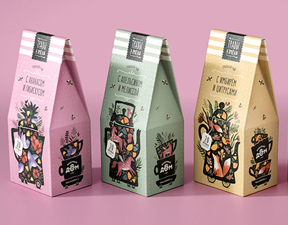
I looked at various books from the library that targeted marketing and package design. The books listed artists/creators who have done incredibly unique designs. I selected designs that linked with my project and some for its qualities such as the colour scheme, design elements, and the aesthetic.


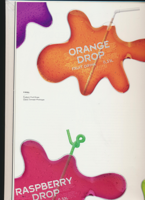
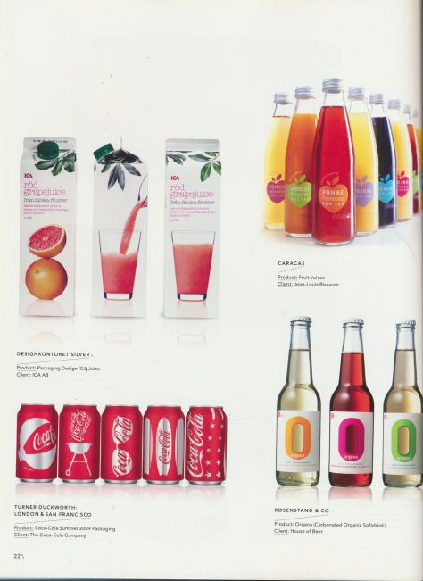
This design gave me the idea of it being a print, just how they have displayed the different colour variants. I like how they are displayed, looks colourful, creative and contemporary.
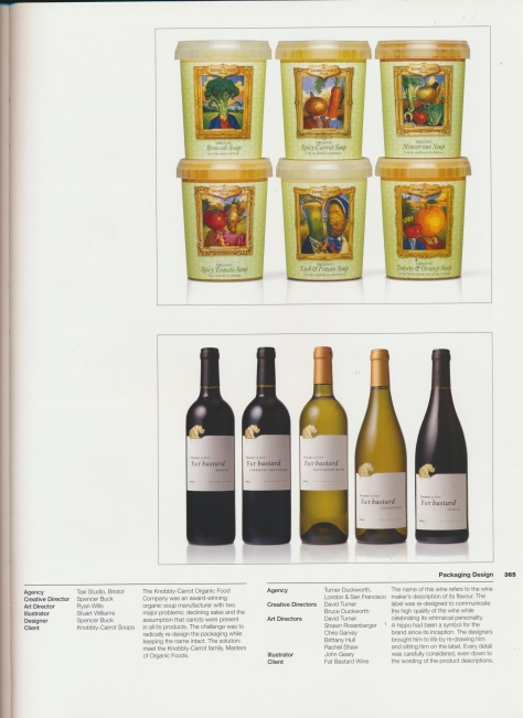
I loved the traditional design on the soup brand, it reminds me of Victorian times, and old oil portrait paintings. The idea of the fruit/veg being a valued member, the main ingredient, someone royal. The design screams artistic, with bright, bold colours with attractive imagery.
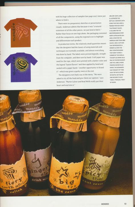
These set an aesthetic, they remind me of sandy deserts, and things cultured. I admire the colour schemes and typography as I think it all really works as a whole design.
Things that pop. I personally love bright coloured things, I am really drawn into it. I would expect brightly coloured products would be sweet, sugary, and fruity, where as something with less colour would taste more bland and possibly be more healthy for you.
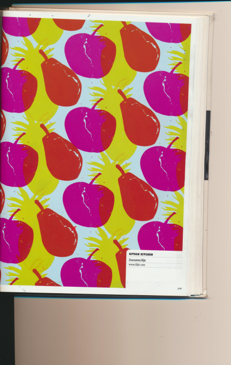
Simple lino print, effective pattern and colours. The colours is what I admire most about this design, they are vivid and eye catching while also clashing too.
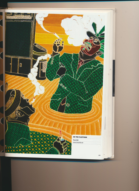
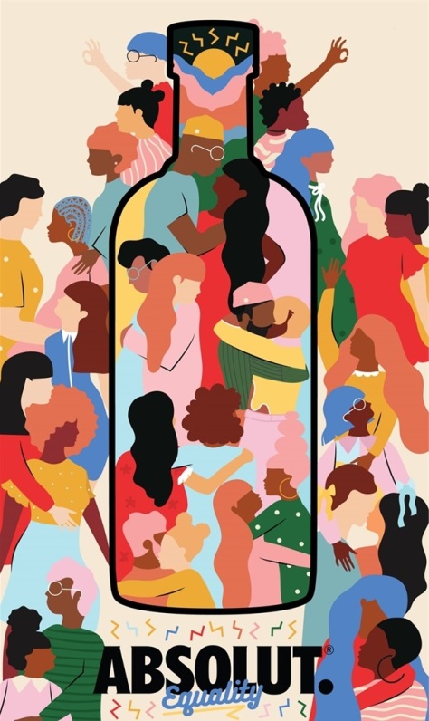
This design has lots of texture that I admire, it has a simple colour scheme with complex details and patterns. It is also a controversial piece which says a lot without actually using words. The semiotics of this piece help the viewer to understand the message behind it.
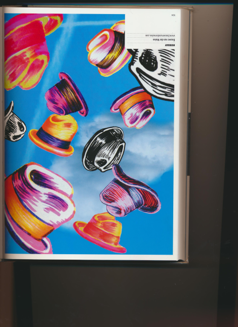
The last four images have print making elements, the one directly above looks like a dry point, etching, which holds a lot of detail, use of line and visual texture, meaning the art on the design speaks more for itself than a load of text.
