Looking into colour, line, pattern and shape. How it make it interesting and exciting, and how to emphasis the design. I have specifically chosen experimental pieces to try explore traditionally and digitally. Using acrylic paint, ink, watercolor and pen/pencil to try create variations of the same image.


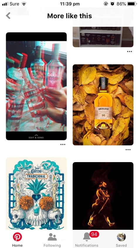
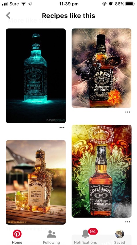
Here I have chosen the more interesting pieces that I wish to try out. Highlighting its colour scheme, patterns and how they have exaggerated the art. 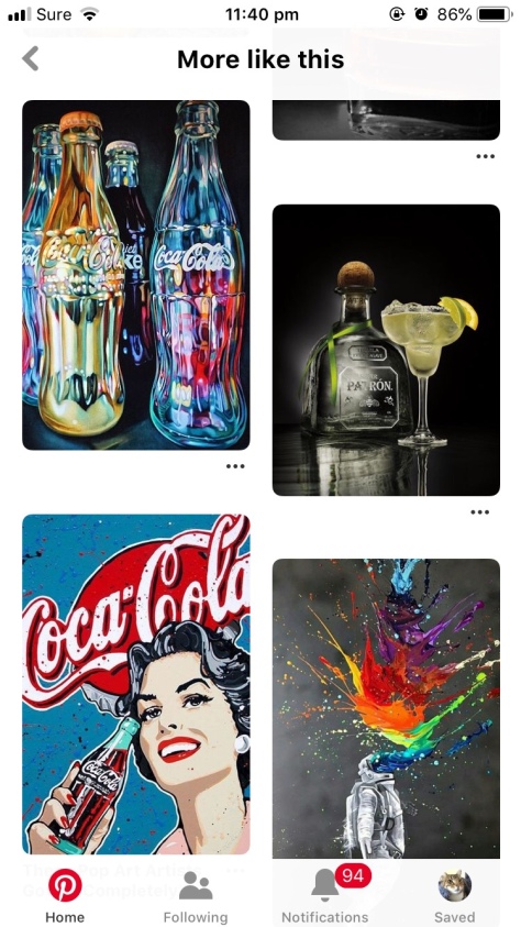
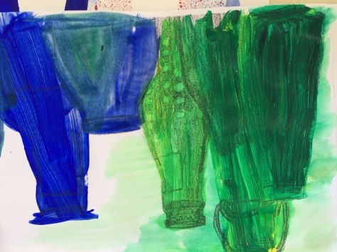
Using water colour paints for a less saturated appearance, leaving it washed out and more transparent, useful for applying layers over the top. 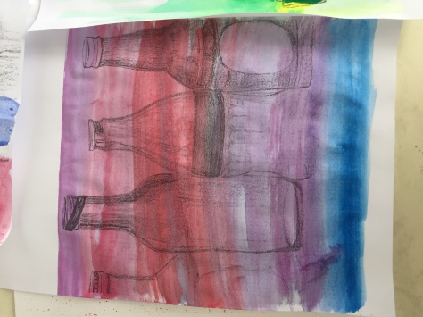
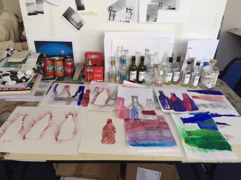
Using multiple variations of composition, layout and pattern.
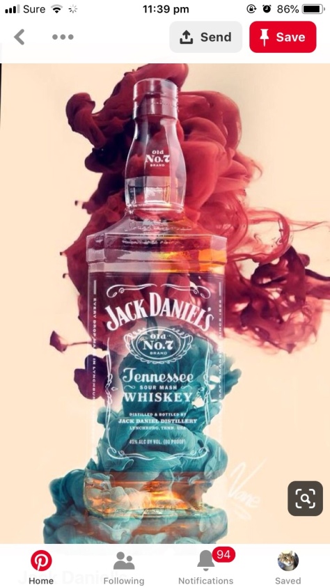
I decided to put these into PhotoShop to edit each one. I wanted to over exaggerate the colour and texture. Using simple adjustment techniques, using *filter gallery*, *image, adjustments*, crop tool, and the select and mask.
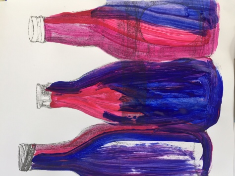
I wanted to make abstract brush strokes to contrast with the straight drawn pencil lines, using a wide paint brush to get a thicker brush stroke. I feel as though they worked successfully, especially when put into Photoshop.


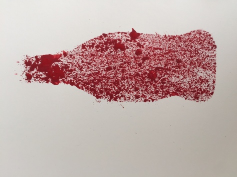
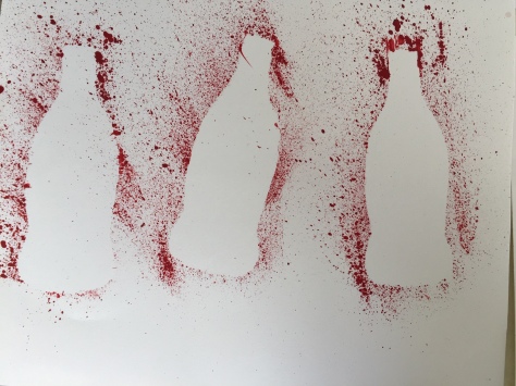
Creating simple Coca cola adverts, using the iconic colour red and a clear representation of the bottle shape. This communicates as the brand because of their brand identity. The adverts were just a quick exercise to show how the paintings could be used, I feel as though they worked well and look as though they could be displayed as décor in a bar/restaurant wall.
