Critical study Jimmy Buffett by Sam Dunn.
Thick to thin lines.marks.
Movement- Direction
Minimal detail
could be stamped, woodcut or lino
I liked this illustration as it looks like a lino or wood cut, which matches with my viking prints that I done. This would help explore the technique further.
Florida Linocut by Travis Pietsch.
Bouncy, rounded font
Detail is prominent but done minimalistically
Done by lino cut
Another way of creating a more natural and organic traditional design. This kind of technique might work better for my work flow.
Behance.
Missing lines and spaces, makes it simply more interesting and more creative. Using basic font but in a creative way. Helps to move away from texture and detail and focusing more on the typography, design and space around the frame.
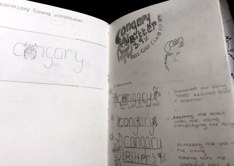
Using the technique that Charlotte taught us, Iterative design. This helps to push the idea on, by making slight adjustments and changes and being able to visualise the design process.
