Diversity is difference, a range of different things or how one thing can mean different things. Diversity is a massive topic in modern society, it comes up in gender equality, nationality and the assortment of products in shops or markets.
https://iso.500px.com/understanding-the-differences-between-commercial-editorial-photography/
Advertising and commercial photographers- Commercial images are created to promote a vast range of products worldwide. The images are there to communicate an idea or a concept while advertising the product or service.
https://www.photoawards.com/top-10-advertising-commercial-photographers/
http://www.photoawards.com/top-10-wildlife-photographers-to-watch/
https://www.topteny.com/top-10-best-commercial-advertising-photographers-in-the-world/
https://luxstudio.london/food-drink
https://www.nhs.uk/live-well/eat-well/eight-tips-for-healthy-eating/
Informative: Using the same idea for the advertising, subject is food and drinks but instead of it being used for decoration or display you can create a informative piece about the drink or food.
Decorative: To make something aesthetically pleasing, to be displayed in a pub, shop, café and so on, it is made for display purpose.
Exhibition: Fine art piece, created for a exhibition wall. It’s purpose is there to be exhibited, with a


The picture of the pastries is my own image, I took it at work after preparing the buffet, shows a range of fillings and flavours while also showing off their individual colour schemes. The selection of teas are my own too, showing different designs and colours. I took a screenshot of the top image, the apple orphanage, this shows a range of there flavoured drinks, the use of bright, bold and beautiful colours.


I used an app on my iPhone to take some of these images. The app is called Huji cam and its basically an old disposable camera style, which creates lots of light flares and adds more colour to the image, one bad thing is that there is a date written at the bottom, which sometimes looks cool and helps to add to the image but there is times were the date is in the way. I feel like the texture from the herbs and spices looks smart, being compared by one another, I wanted to highlight this in the bottom close up image, the image shows colour and texture.
who would use these? The audience for this product would be for chefs, cooks or just for at home. It would be seen in shops, restaurant kitchens and home kitchens. These spices are used around the world, in many countries, but each country has their own individual flavours and foods that some of these might be used or not.


Adidas range, how the style has differed slightly within the designs. Keeping the logo or iconic three stripes in each design, showing their unique brand. These are just a few of my jumpers, but I thought it was best to stick to one brand, so I could explore other brands too.
Who is the audience? This specific brand has been generated and designed for many years. It first was made for sports purpose, but people used it for casual wear. These specific jumpers have the same elements of the design guideline, three stripes or their unique logo. The age it is targeted for an all round audience, the clothes are baught by adults and parents but worn by children, teenagers and adults.
![]()


The Robinsons range I have at home, showing colour and shape. I feel as though these images are quite exciting, the Huji cam effect is a great touch for the coloured elements while also creating a slight blur on the outline of things, which all make a more interesting image, more what I mean is that it can make a boring image, exciting.
Who drinks these? Who are they designed for? These drinks are designed for adults and parents to buy for themselves or their families, but they are drank by children and adults. They appeal to children and adults because of their design, using colour and shape to make it eye catching. Each individual juice has a bright colour and looks delicious.


The change of shape, colour, substance and product. Who drinks each one? Where would be bought?
Gender stereotypes
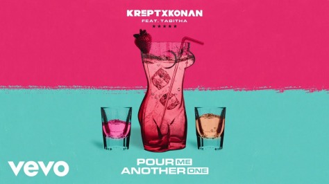
The specific image is a design for a song, I feel as though they have tried to portray gender stereotypes. The curvy bottle represents a women’s body so it possibly could be associated as a women’s drink.
