Bottle shape- Each brand have their own bottle shape and size, their own unique style. It also depends what the substance is, it needs to relate to it, fits the purpose.
Colour choice- Again it all depends on what it is, for example if its milk, you would associate colours like white, red, green and blue, as this is a generic colour system for different milks.
Form- The form of the product is very important, if it doesn’t suit the substance then it wont communicate to the audience properly.
Function- The function of the bottle is also an important aspect, how you drink or pour the drink. It needs to logical and easy to hold.
Audience- The audience is based around adults and an older audience, but depending on what the product is it will differ in viewers.


")


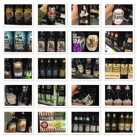
I found these various bottled beers, lagers and ales in Peel Shoprite, they have an enormous variety of alcohol. All the designs differ in style and design, they have quite tacky designs which appear cheaper and more affordable, whereas the images below show to be more expensive, they use a limited colour palette and design elements and have a simplistic style.
The images below come in designed packaging which to me suggests expensive, they can have a simple bottle design but displayed in a more complex, rich designed box or tub.
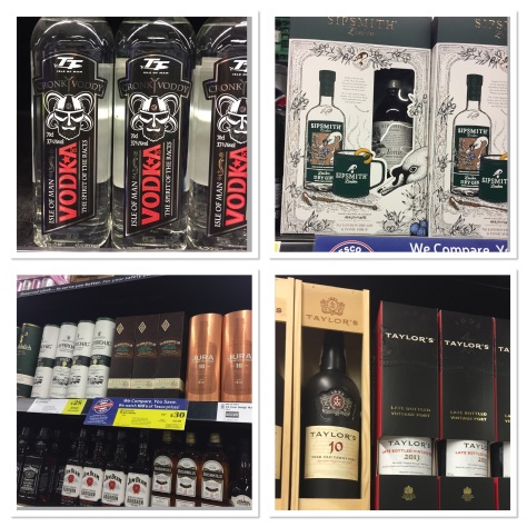
The colour shows importance, if a bottle is shown in gold, bronze or silver it can mean that it is expensive and made for quality taste. which is communicated well in each design. I think the outer packaging is a great aspect for the product, it can hold more design elements than the design of the bottle.
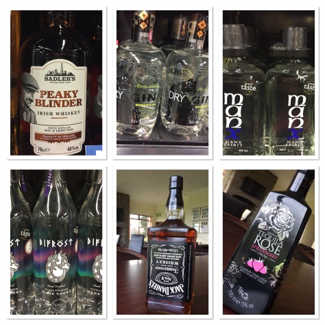
The selection of drinks here is showing examples of Manx made beverages and some iconic brands, the Jack Daniels bottle is made for a bar optic, so it has been designed upside down for a purpose. I think the darker glass or coloured bottle works better than the transparent bottle, as the text shows up more clearly, but I think the transparent finish gives a more artistic style, because of how the lighting is affected by the material and creates interesting patterns.
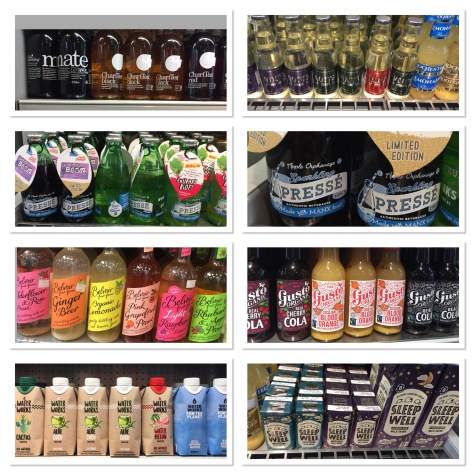
These images show a range of different soft drinks, the colours they have used and typeface, and the bottle shape. Each design is giving you a different substance. The use of glass is used heavily in production now, because they can be reused, refilled and recycled, the Apple Orphanage has their own policy that if you recycle the bottles they will give you a free refill. This tactic is used for marketing and sales, this will appeal to more customers because it is saving the planet and money.
Some brands love using strong colours, whereas the “Water works” drink has used limited colour and in a minimalist way which I think works better than large areas of colour but it all depends on what you are trying to say about the product. I feel as though the “Belvoir” drinks are trying to portray a feminine, colourful and vibrant style which appeals to a female audience, comparing to the “Water works” beverage which I feel if trying to communicate to a wider audience, using minimal colour, which stands out next to the muted coloured background and text.
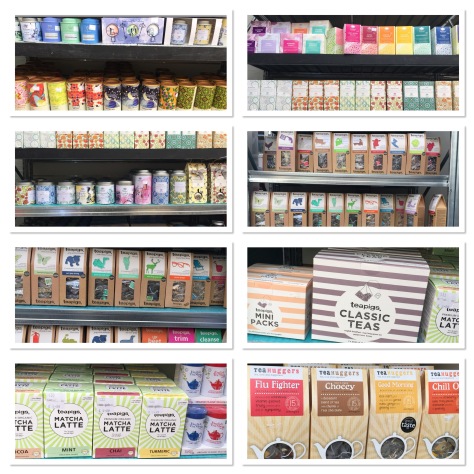
I am a massive fan of flavoured tea, I purchase it on a regular basis, but I don’t particularly buy “Teapigs” and “Tea huggers” because they’re very expensive, but I felt as though I needed to try and test them so I can fully research this project. It is safe to say that they were delicious! I love the design on flavoured teas, they each have their own little styles which differ for each flavour, some tea packaging uses bold imagery like “Teapigs” or they use pattern based illustrations which is usualy repeated over the whole product. Complementary colours when displayed next to each other on a shelf.
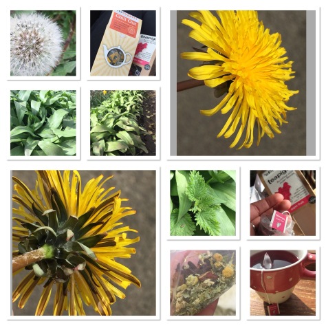
Stepping away from just bought products and moving towards natural herbal teas which can be made at home. Nettles, Danelion and Garlic can all be used in our foods or drinks, and all have natural health benefits for us and can be made cheaply. In the tea bags I bought it shows the different dried ingredients, giving you a natural and earthy drink.
After researching I found that my research was becoming to broad, and that I did not have a clear idea of what I wanted to achieve. I then thought about my work place, and the bitter brand we sell, this brand was made for our club and was named after it too, so this meant it was a more personal design and could be a potential business offer for me to ask the club.
The bitter is called “Congary”, the Congary is a part of the course, where the club was founded. Making it special to Peel Golf Club. The logo needs to include the name of the bitter obviously and display “Peel Golf Club EST 1895” somewhere in the design, still showing the Viking identity. Making it diverse to the other bitter brands on island or in UK.
